Rollhouse Foods Product Photography: Making Frozen Food Look Like Tonight's Dinner
Sushi trays, fruit cups, fried rice, subs. All of it sold in a package, all of it competing with whatever is next to it in the case. Here is how we photographed a full product line so it looked like a meal and not an inventory list.
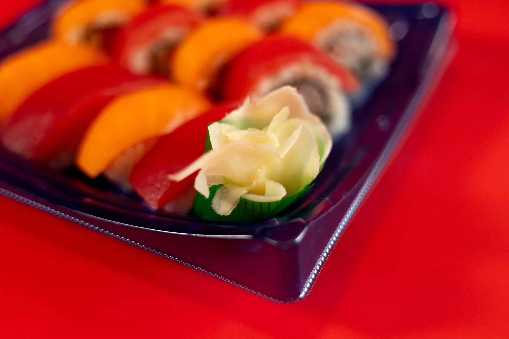
Packaged and frozen food is hard to photograph because the package is the product and the package is also the problem: plastic glares, containers hide the food, and everything is the same shape. For Rollhouse Foods we solved it with two backgrounds, one set of hands, and a rule that every item got shot both in its container and out of it.
- A clean white set for the packaging shots and a bold red set for the "dinner" shots
- Chopsticks and a hand in about a third of the frames, so the food has scale and a person
- One item pulled out of its container per product, so buyers can see what they are actually getting
Food that comes in a container has a specific problem: the thing that makes it convenient is the thing that makes it look unappetizing. Nobody has ever been hungry for a clamshell. So when Rollhouse Foods asked me to photograph their line, the brief I wrote for myself was simple. Show the package, because shoppers need to recognize it. Then get the food out of the package and make it look like something you would put on a plate at 6 p.m.
Quick introduction for anyone new here: Sarah Rasmussen, commercial photographer and video person, Logan, Utah, working with food and product brands across Cache Valley through Sarah Rasmussen Productions. Most of my food work is restaurants. This one was different, and the differences are the whole post.
What we were photographing
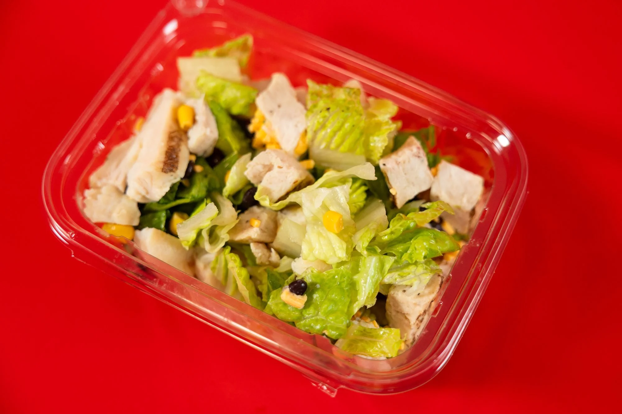
The Rollhouse line covers more ground than you would guess from the name. On the day we shot: sushi trays with tuna and salmon-style toppings, cut fruit cups with watermelon, cantaloupe, and honeydew, chicken salads over romaine, a fried rice bowl with chicken and egg, a breaded cutlet with rice, and a sub sandwich with deli meat, lettuce, and tomato. Six product families, each in its own container, each needing to look like it belongs to the same brand.
That last part matters. When the products sit side by side in a case, they need to read as one company. When they sit side by side on a website, same thing. So before we shot a single frame, we settled on two setups and did not deviate from them.
Setup one: white, for the package
Every product got a clean shot in its container on a seamless white background, lit soft from above and the side to keep reflections off the plastic. These are the practical frames: the ones that go on a product page, a sell sheet, or a distributor deck. They are not exciting. They are not supposed to be. Their job is recognition, so a shopper who saw the photo online can find the same thing in the case.
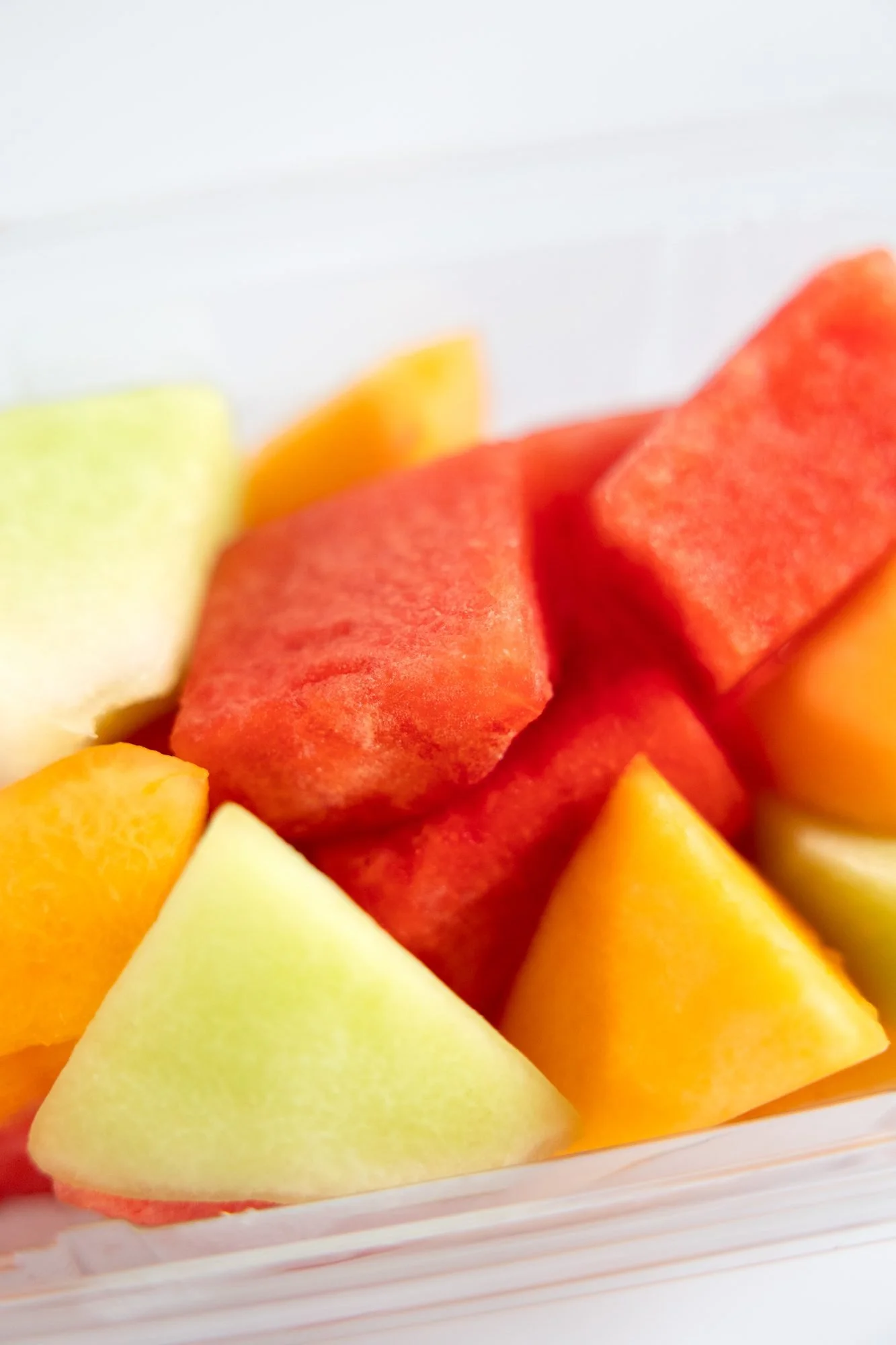
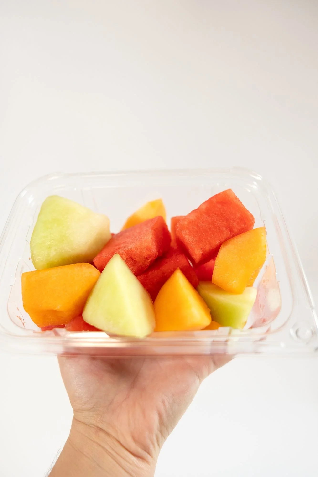
The plastic was the fight. Clear containers pick up every light source in the room, and the difference between "crisp" and "greasy looking" is about two inches of light position. We shot most of the white-set frames with the lids off and the camera slightly low, so the food fills the frame and the container becomes a shape around it rather than the subject.
Setup two: red, for dinner
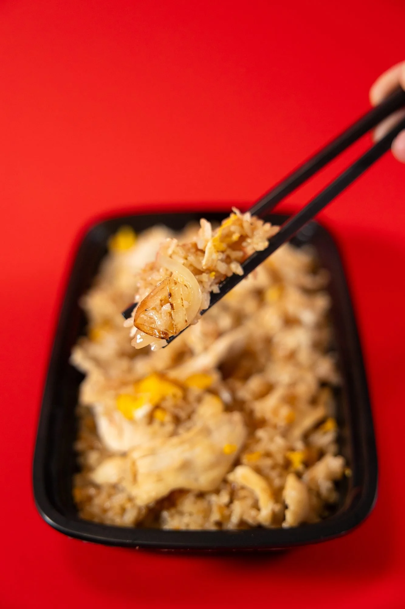
The second set was a solid red backdrop, and this is where the food got to be food. Same products, but now the sushi tray is angled and tight, the fried rice has chopsticks lifting a piece of chicken out of it, the sub is sitting on the surface like you just unwrapped it. The red is bold enough to pop on a phone screen and warm enough that the food does not go cold looking. It also gave the whole line a signature. Line the red frames up in a grid and they are unmistakably one brand.
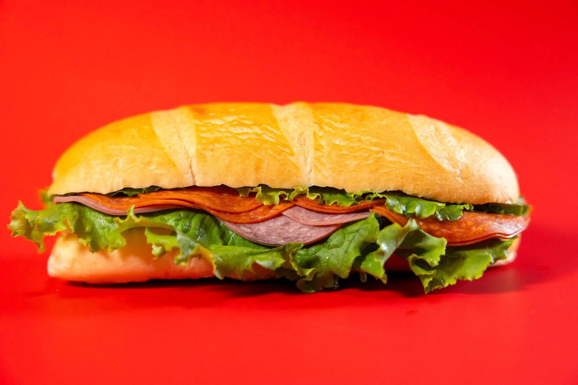
Nobody has ever been hungry for a clamshell, so the food has to come out of it.
Hands and chopsticks in a third of the frames
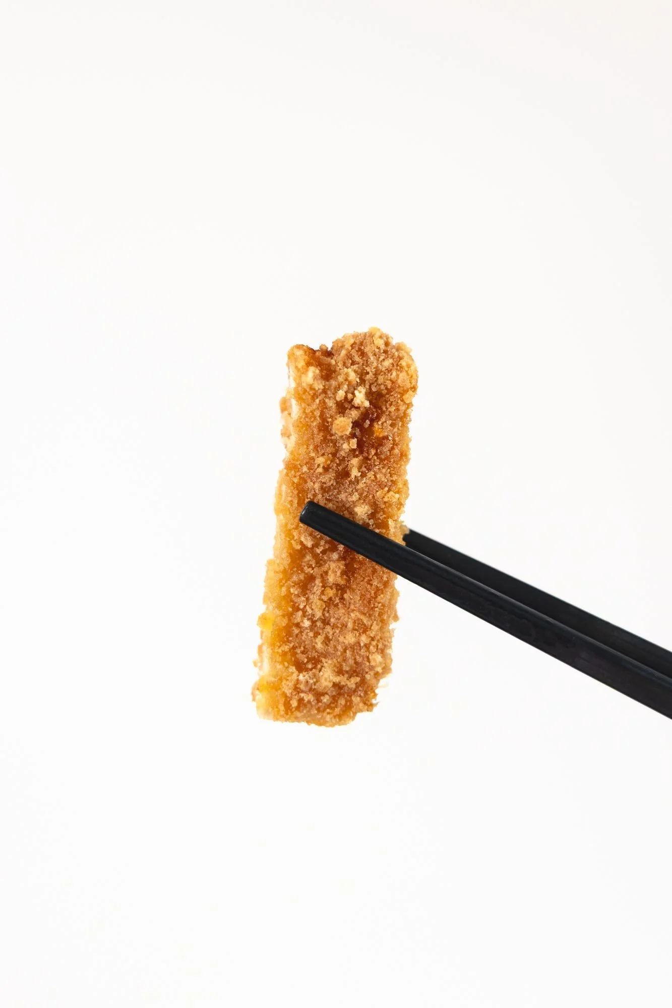
The easiest way to make packaged food look like a meal is to show someone about to eat it. We used a single pair of hands for the whole shoot so the frames stay consistent, and we used chopsticks for anything Asian-leaning: a piece of chicken lifted from the fried rice, a single sushi roll held against white, a cube of watermelon on the tips. Those detail frames are small and they are the ones people stop on. A tray of sushi is a product. One roll, held up, is a bite.
Why every product got shot twice
It would have been faster to pick one look and run the whole line through it. We did not, because the two sets answer two different questions. The white frames answer "what is this and will I recognize it." The red frames answer "do I want to eat it." A product page needs both. A social feed mostly needs the second. A distributor mostly needs the first. Shooting both on the same day, with the same food, costs a little more time and saves an entire second shoot.
It also means the client can change their mind later without calling me. New website template that wants clean white product images? Done. Instagram push that wants bold color? Done. The library covers it. I have written before about building a content library, and this shoot is a good example of doing it on purpose from the start.
What I would tell any packaged food brand
Bring more product than you think you need, because food under lights has a short life and the second cup of fruit always looks better than the first. Decide on your two looks before the shoot, not during it. Budget time for the detail frames, because the single-bite shots take as long as the full-tray shots and get used twice as often. And if your product lives in a container, plan to photograph it out of the container at least once. That is the frame that makes someone hungry.
If you are getting a shoot like this ready, how to prepare your business for a brand shoot covers the practical side, and my investment page lays out the starting points.
Pull up your product photos and sort them into two piles: "you can tell what it is" and "you want to eat it." If everything lands in the first pile, book a half day and shoot the second pile. If everything lands in the second pile, you probably have a recognition problem in the case and need the boring white frames. Most brands have only one pile. The ones that sell have both.
Packaged food is a genuinely hard thing to photograph well, and the brands that do it well look effortless, which is the unfair part. Two sets, one pair of hands, everything shot twice. That is the recipe.
You will find me and Sarah Rasmussen Productions in Logan, photographing food, products, and the people who make them for brands across Cache Valley and Northern Utah.
See more of my product photography in Logan.
Does your product look like dinner, or like inventory?
Send me a photo of your current packaging and I will tell you which of the two setups it needs first.
Book a product shoot📞 Call or Text: 435-764-3606
✉️ sarahrasmussenproductions@gmail.com
📍 Serving Northern Utah & Southern Idaho
